SMARTAKÖK DIGITAL SIGNAGE SOLUTION
Using digital signage to simplify content control across multiple venues
Project Details
Challenge
Outcome
Research & Insights
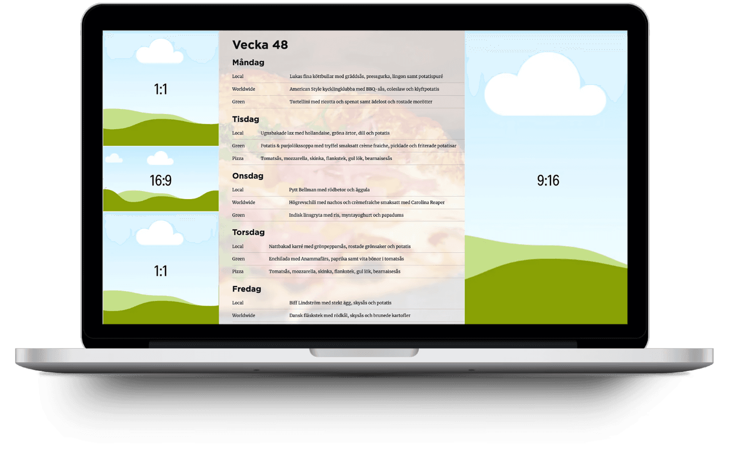
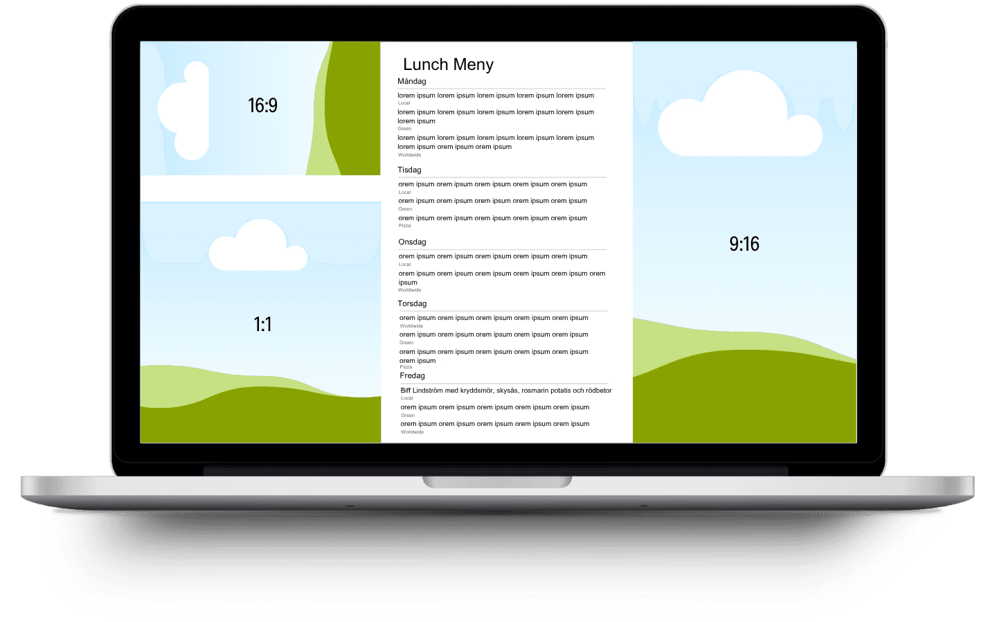
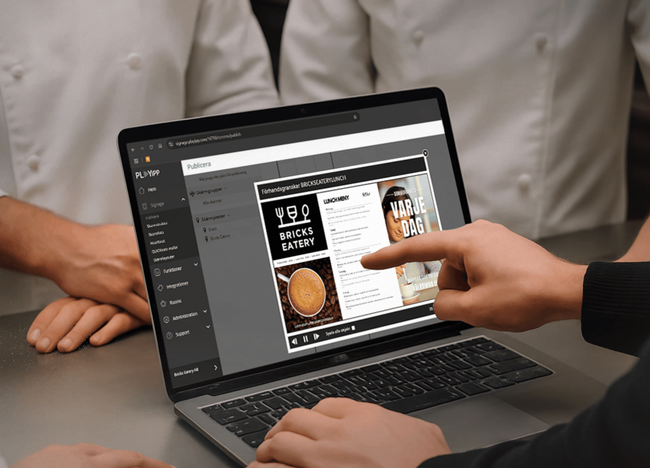
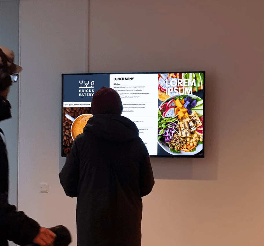
The first goal was to define the layout, including an interactive menu and sections for promotions and information. Priorities were accessibility, readability, and making updates easy for local staff. The layout also had to support four standard formats (1:1, 16:9, 9:16) to allow for stock material. Below are the three main solutions we explored.
Playipp's menu feature
more info

Website screenshot
more info
Manual template
more info
User & Usability Testing
After creating and evaluating the three prototypes, the next step was to conduct usability testing and, together with the restaurant staff, decide which option to move forward with. Additionally, we needed to ensure the signage solution worked in real-world conditions. To address this, we conducted a usability workshop with the staff to decide on the layout, and then proceeded with user testing with the intended clients.
A competitive analysis and targeted survey revealed a market gap for a polished, professional budget cleaning service, guiding RENVA’s positioning and customer targeting.
more info
concept development
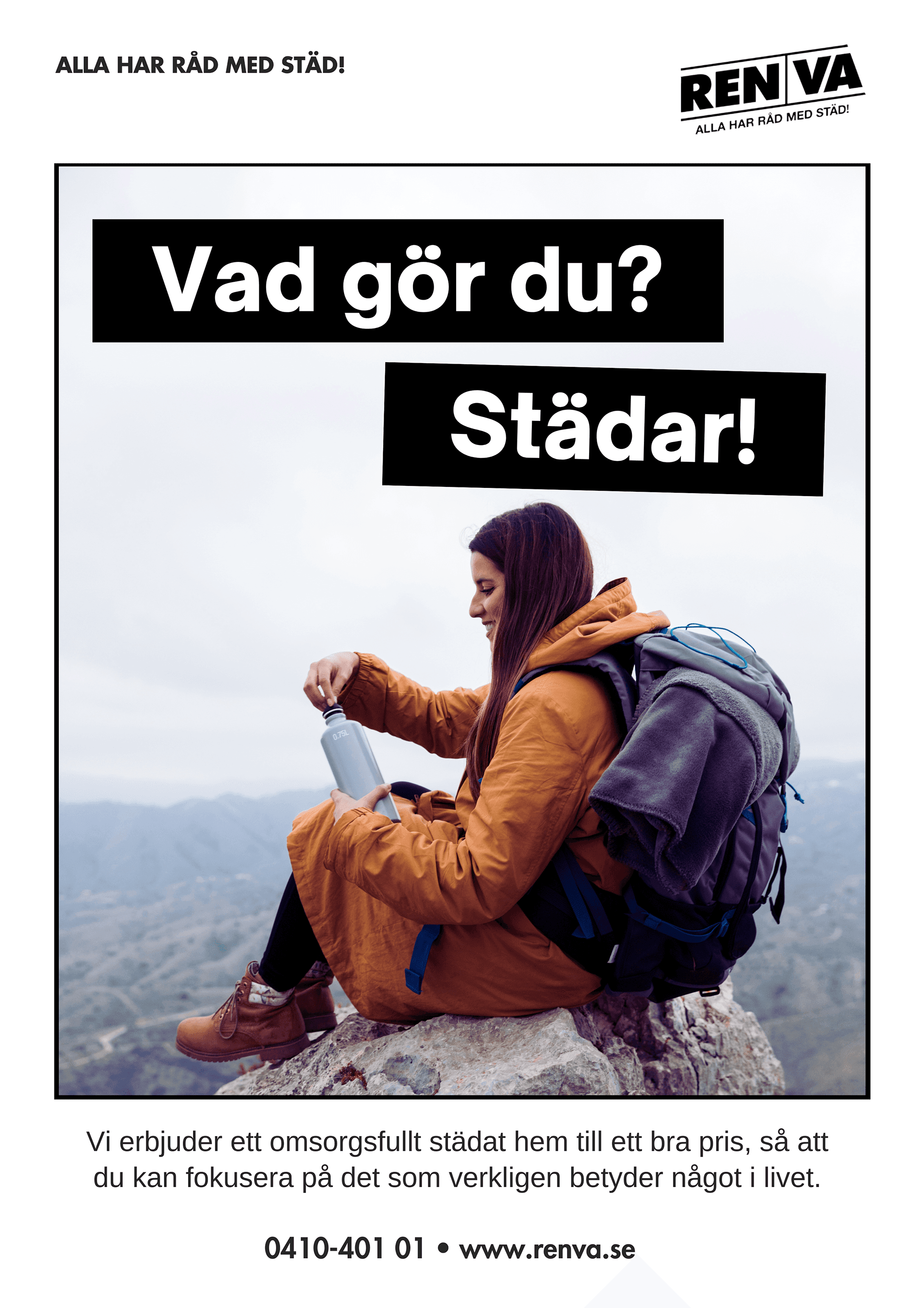
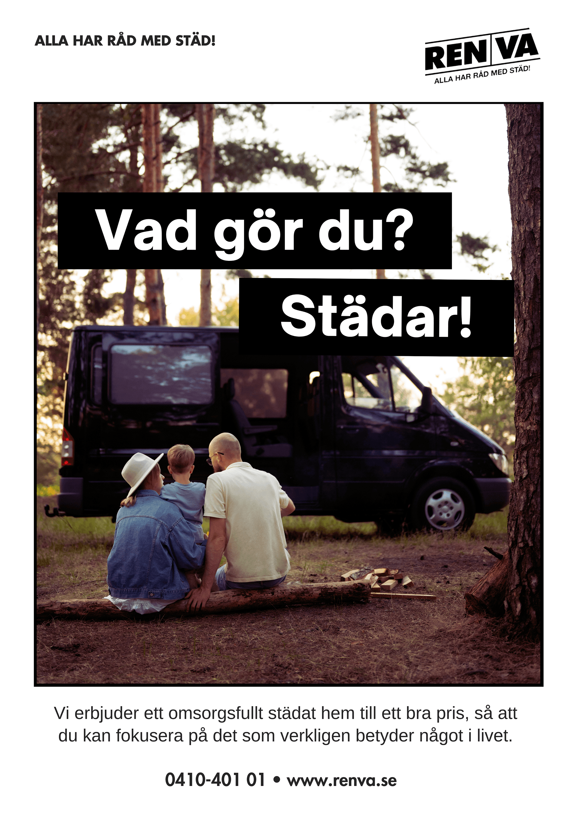
The core concept was to highlight how cleaning takes time away from the things that truly matter in life. The messaging needed to resonate emotionally, reminding people that their time is precious. We wanted to position RENVA as more than just a cleaning service. It’s a time-saver, a stress-reducer, and a way to focus on what truly matters in life, whether that's family, work, rest, or joy.
Layout & menu
The first objective in this project was to determine the layout which included an interactive menu and additional sections of the digital signage. The most important factors to consider was high accessibility and readability from a user perspective and that the menu was easy for local staff to update on the spot. In addition to the menu function, the screen itself needed to accommodate four additional sections with standardized formats such as 1:1, 16:9, and 9:16 to allow for stock material to be used for promotions or information. Below are the three main solutions we considered.
Setting the tone
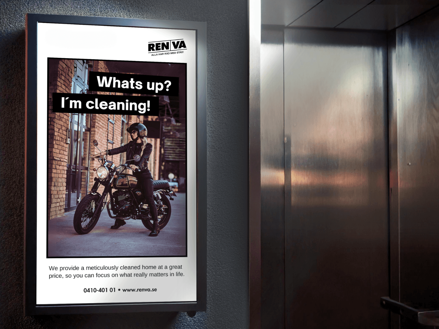
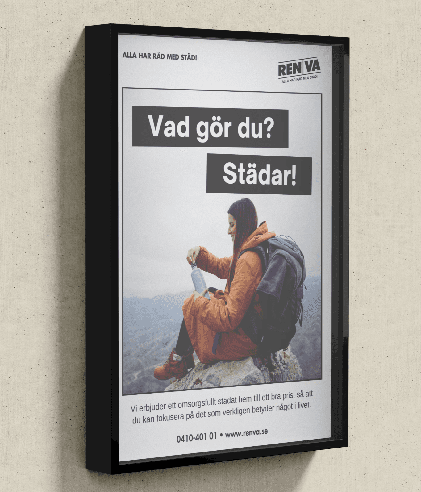
The visuals were designed to reflect the concept of not prioritizing the more important things in life. Different activities, and family scenes were chosen to mirror the lifestyle of typical clients, ensuring the campaign felt relatable and authentic. User tests showed a cinematic style engaged the audience best.
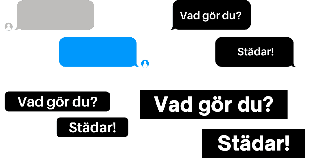
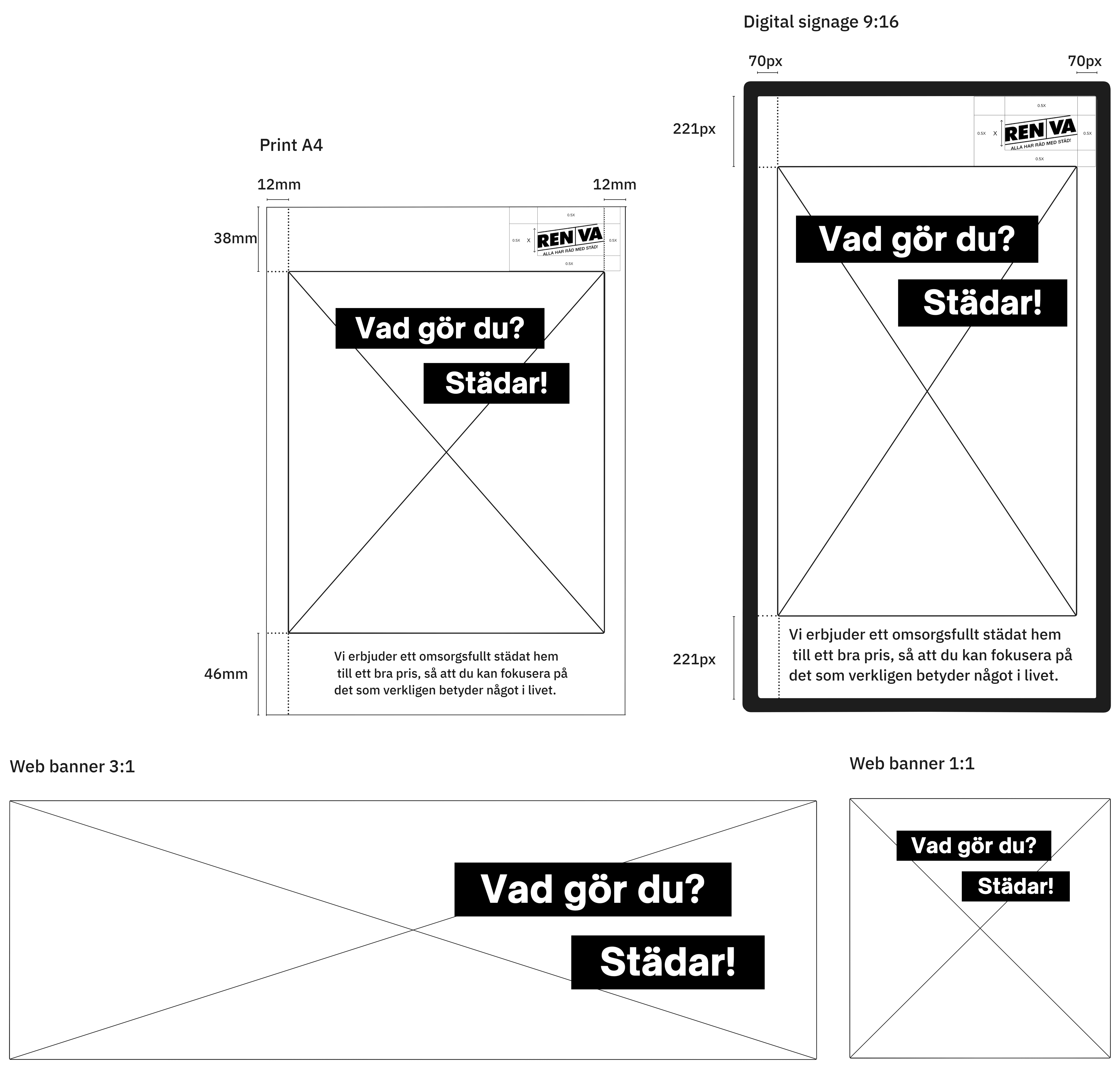
design and layout
The layout for web, print, and digital signage was defined with a focus on maximizing image size and maintaining optical balance. Design elements like margins and alignment were refined to match RENVA’s visual identity. Custom banners and message bubbles were developed to present key messages as a conversation. Sharp corners and a black color scheme were chosen for consistency and a sleek, professional look.