Problem definition
OICAN had noticed recurring usability issues on their e-commerce site. Customers were reporting difficulties navigating products, leaving reviews, and encountering other issues with the user flow. Additionally, the team was seeing conversion rates below expectations (<1%), prompting the decision to focus on improving usability as the first step.
My role
I analyzed user data from Google Analytics and Shopify to pinpoint where issues and drop-offs occurred. Using heatmaps, I examined user behavior to understand the reasons behind the drop-off. I then conducted user testing with a small group to validate pain points. Based on these insights, I applied best practices (Baymard) to create and test a prototype addressing key issues. I collaborated with the development team to implement the changes and conducted pre/post testing to measure their impact.
Early estimates
pre/post data is currently being analyzed. However, early data shows a significantly reduced dropout rate on the Collections page and the Products page. Furthermore, data points towards improvements in conversion rates.
Tools
Figma, Shopify (analytics), Hotjar, Google analytics

Research & insights
Baymard Institute guidelines
why? because I had limited I have limited user testing resources and want to use proven standards as a baseline.
Design decisions were aligned with both user feedback and established e-commerce best practices, including guidelines from the Baymard Institute.


Artist inspiration board
The first step was understanding the artists themselves. By analyzing their style and overall vibe, we gained insights into their unique audiences. A key tool in this process was the Artist Inspiration Board, which brought together visual references showcasing their work, past exhibitions, and the emotions they evoked. This helped define the target audience and guided design decisions, shaping everything from mood and color choices to the overall visual direction.
Audience segmentation table
To organize the data, an audience segmentation table was created to identify key groups, including families, teens, and fans of rock and dansband music. Based on these insights, a set of design guidelines was developed to ensure the visuals resonated with each audience segment.

Concept & Design
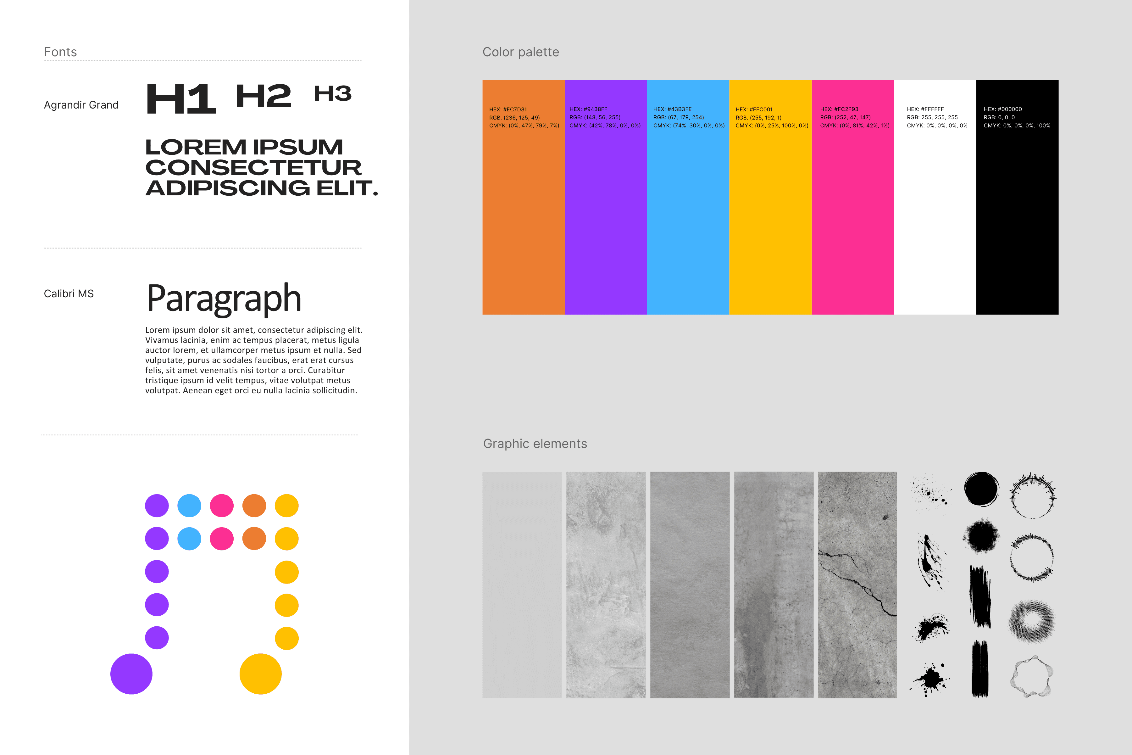
Style guide
Building on the research and insights, a basic style guide was outlined to make sure that the brand and design was consistent throughout the project.
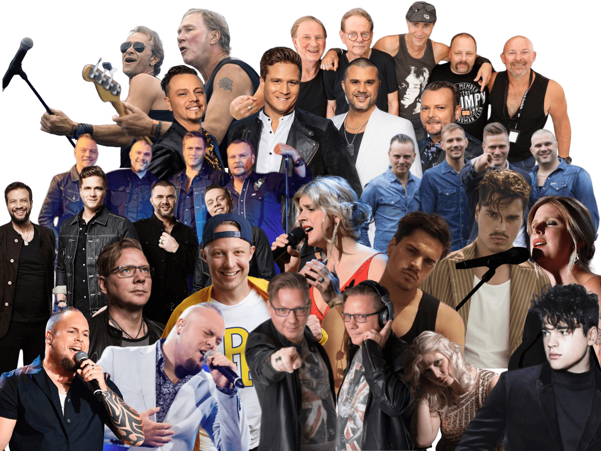
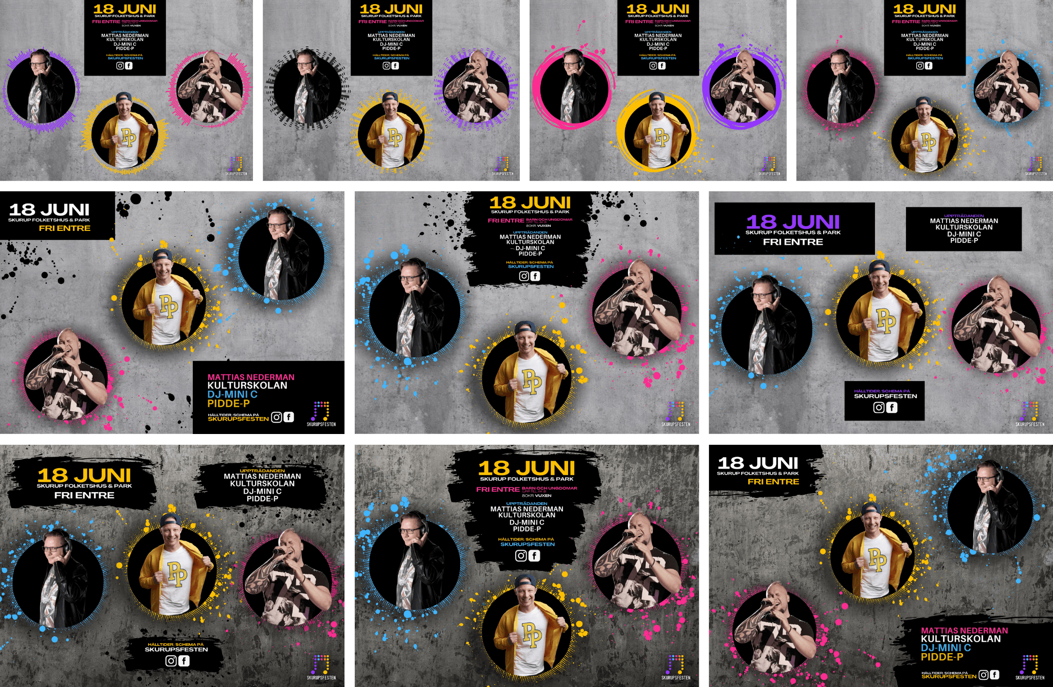
Organizing images
Collecting artist images posed a challenge, as some artists / labels provided high-quality official photos while others did not, leading to uncertainty regarding image rights. To advance the layout in cases where photos were missing, the highest quality stock images were used as temporary placeholders while image rights were being pursued.
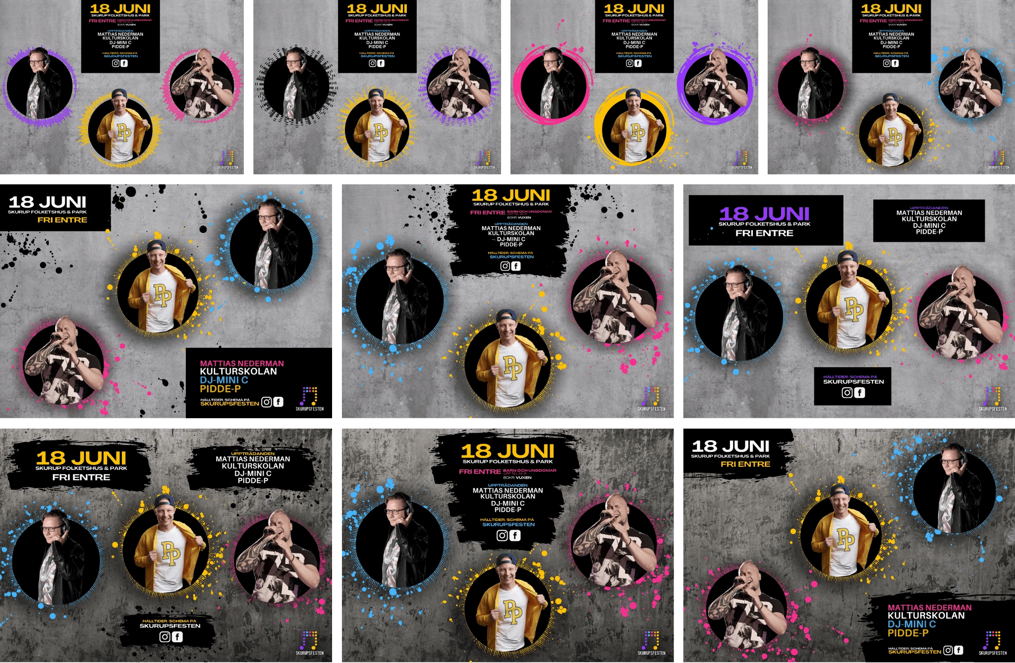
Artist compositions
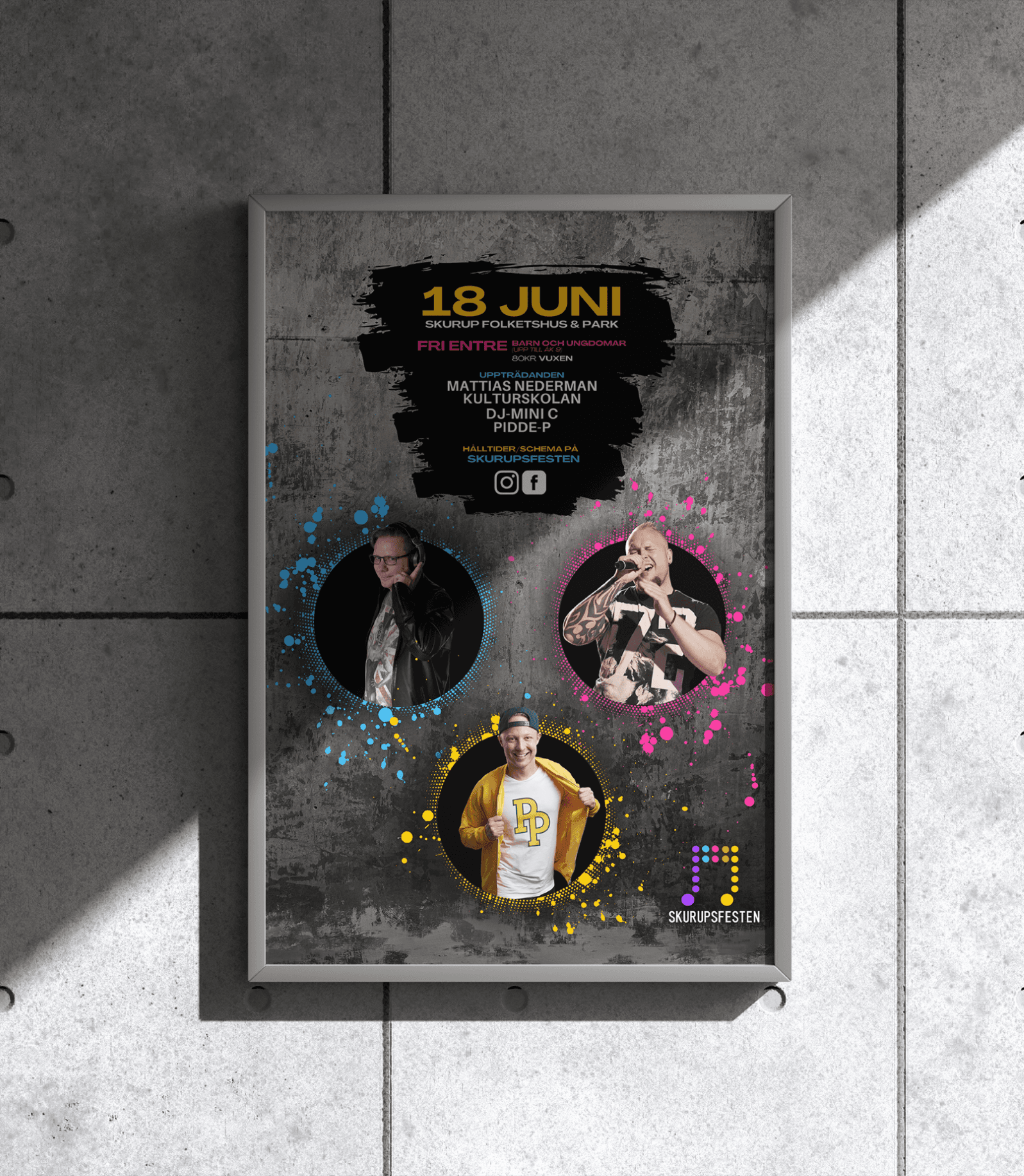
Deciding and composing the artist images, as well as creating the collages, involved extensive work to cut out the artists and experiment with various combinations to find the most compelling visual groupings. Special attention was given to artist hierarchy, with headlining acts receiving greater visibility. For example, in the Youth Day event, the main artist, Pidde-P, was placed prominently at the center and slightly enlarged to enhance his presence.
Deliverables